Digital card brand strategy
Design lead in a cross-functional team
2017
Defending the role of a brand. As Visa’s cards propagate to more digital mediums, challenges to the Visa’s brand rules for physical cards emerged for digital card images. These challenges were especially prevalent in markets where Visa partners with another payment scheme (a payment network similar to Visa’s) to process payments, and I worked alongside strategy and product teams to conduct UX research to guide our business decisions and substantiate our digital card brand strategy for various markets.
CHALLENGE
Welcoming a digital disruption
In markets where Visa doesn’t process payments (usually due to regulations), Visa works with partner schemes to enable consumers to pay with Visa cards by getting the transactions processed by partners. Traditionally, the partner brand would be displayed on the back of the physical card, while Visa’s brand remains on the front lower right corner. With user adoption of digital wallets like Apple Pay, partner schemes started to challenge their brand placement, since digital card images can be easily and dynamically changed. Many wanted to be displayed more prominently on the front of the card, or even replace Visa’s position under certain use cases. Change in brand placement could disrupt user’s trust at the payment moment, and impact payment routing and associated fees that carry consequences down the value chain. So it was important for Visa to form a strategy that not only preserves user’s trust, but also defend our position and that of our clients.
PROCESS
Letting consumer choice drive incentives
Laying out all the stakeholders in the value chain, we concluded that consumer choice is really the fundamental factor that drives every stakeholder’s incentives and hurdles. Consumer choice could bring alignment across the board and provide the necessary rationale for Visa to persuade others of our point of view. To that end, I conducted UX research to demonstrate users’ mental model around payment schemes, comparing status quo to several variations of more “dynamic” digital card images to measure the impact a change in brand placement would bring to the card payment experience.
RESEARCH
All hands on deck
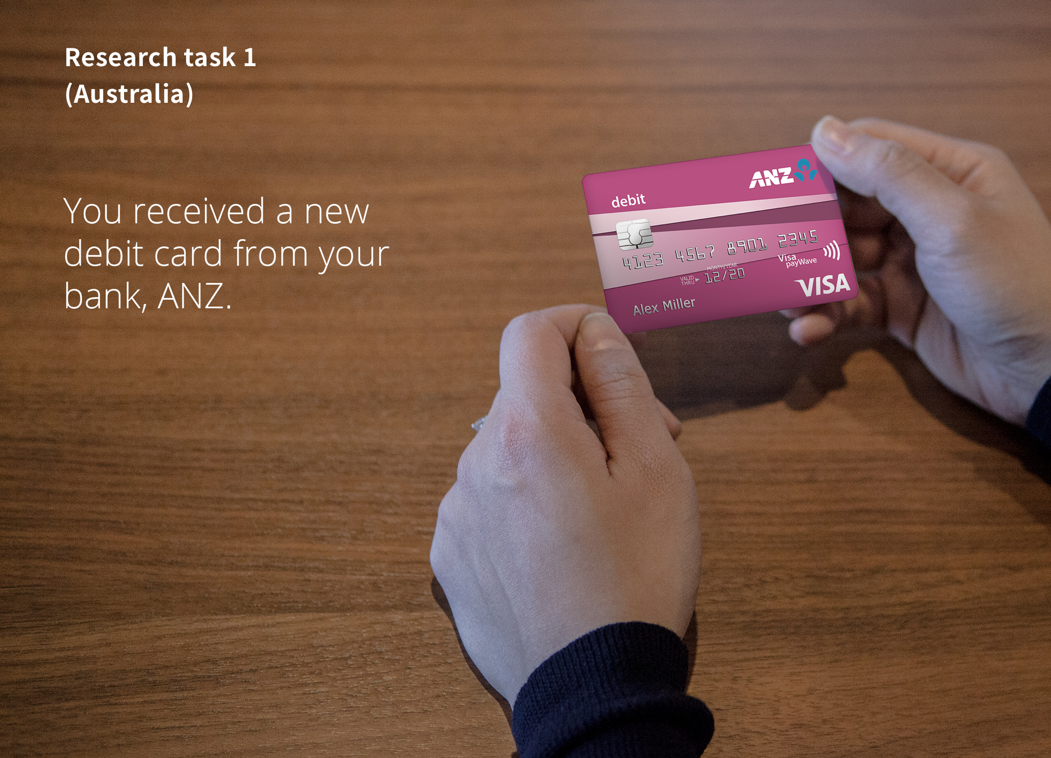
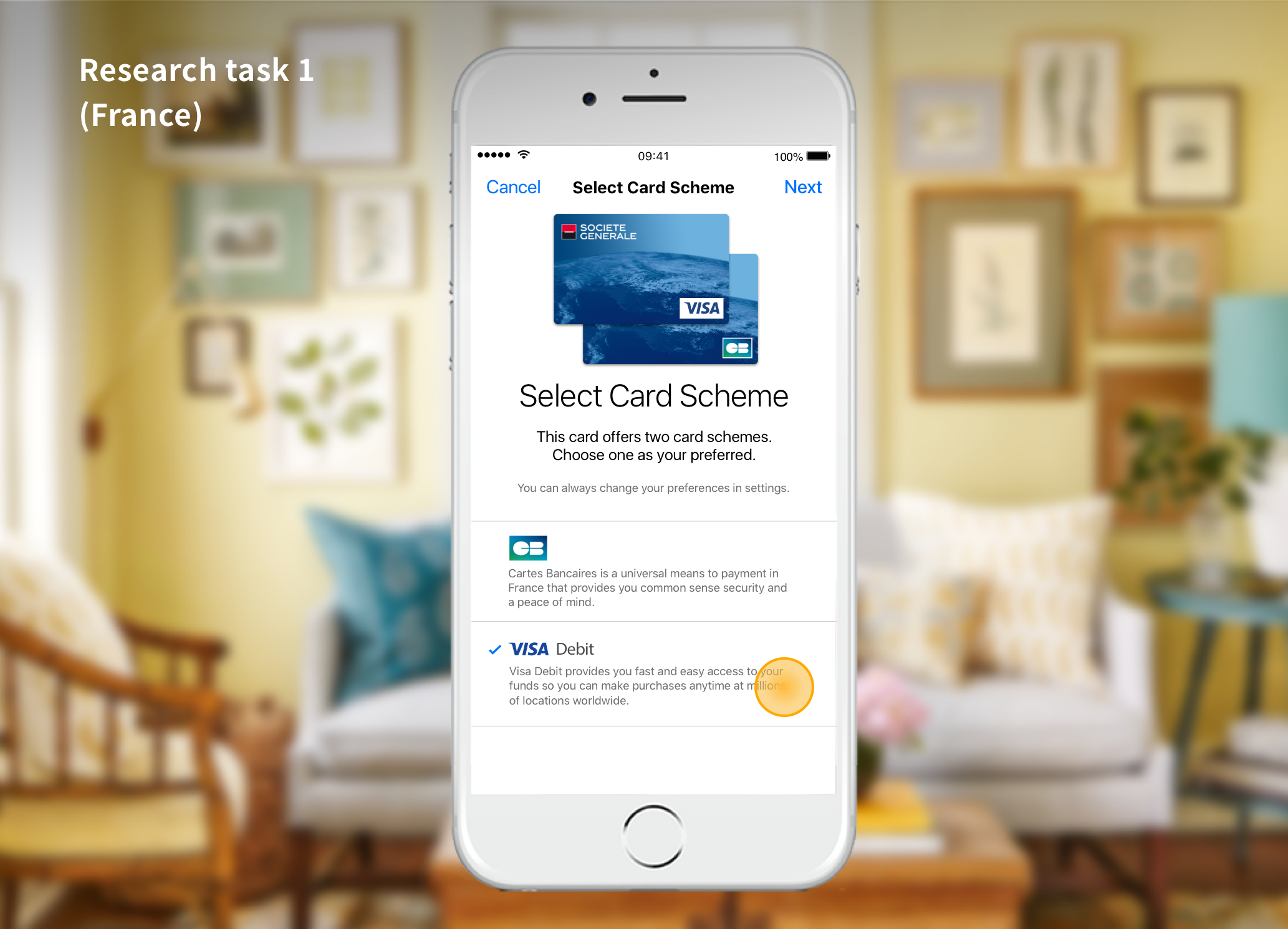
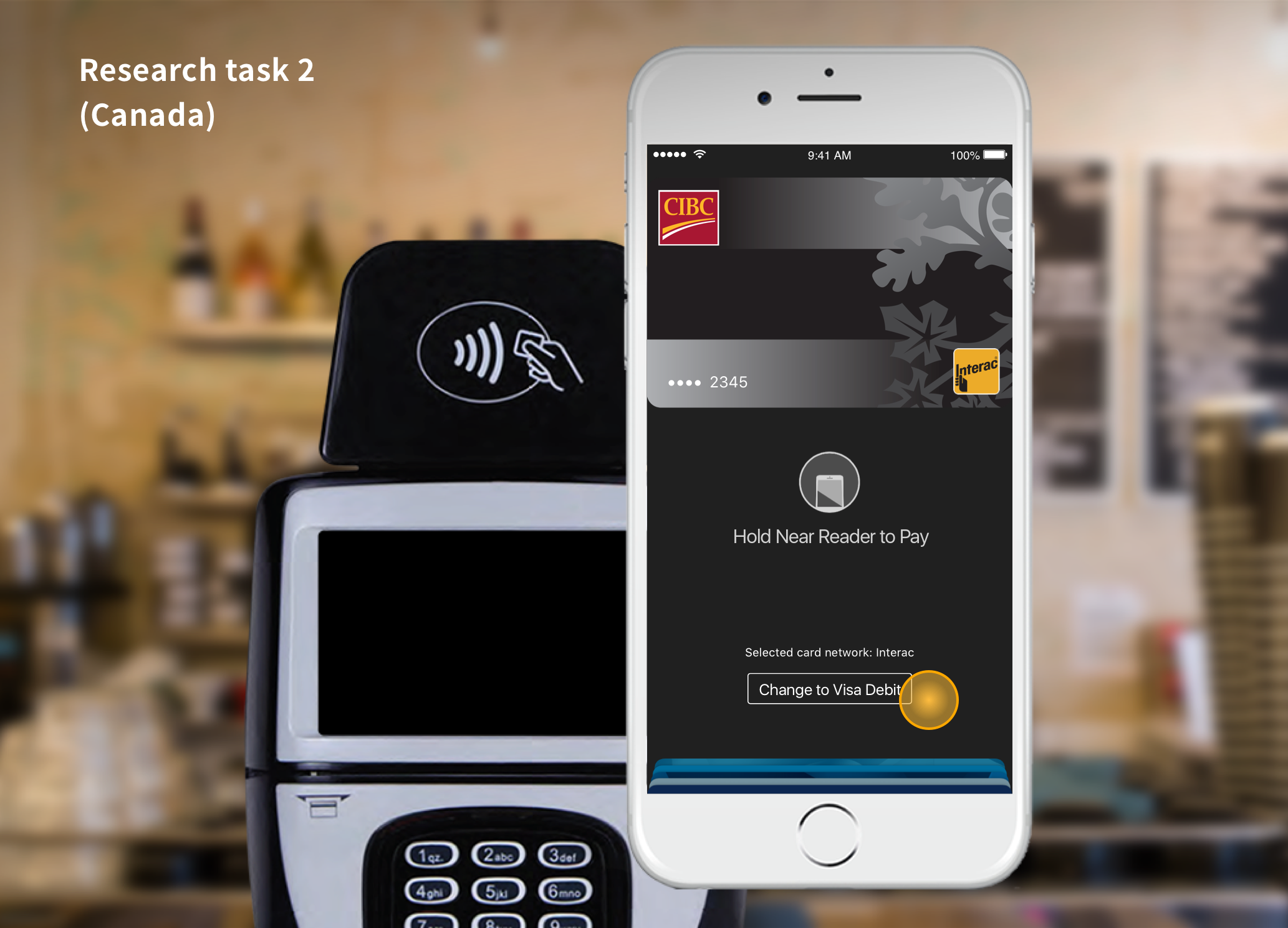
I created 4 design options to compare the status quo “plastic model” against 3 other "artificial separation” options where the digital card is either represented twice or changes dynamically when a particular scheme is used. With a tight deadline, a full scale research study was not an option. I utilized the UserTesting.com platform to run 72 tests where users clicked through tasks in a prototype mimicking a point-of-sale payment and answered questions about their experience. It was too much qualitative data for me to analyze in a short time, so I pulled in other team members to help and was able to introduce several non-designers to the process of UX research.
OUTCOME
Innovating in the right places
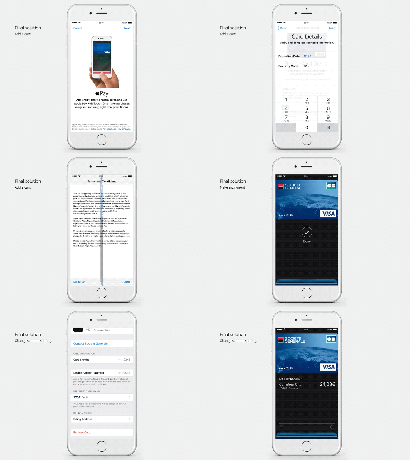
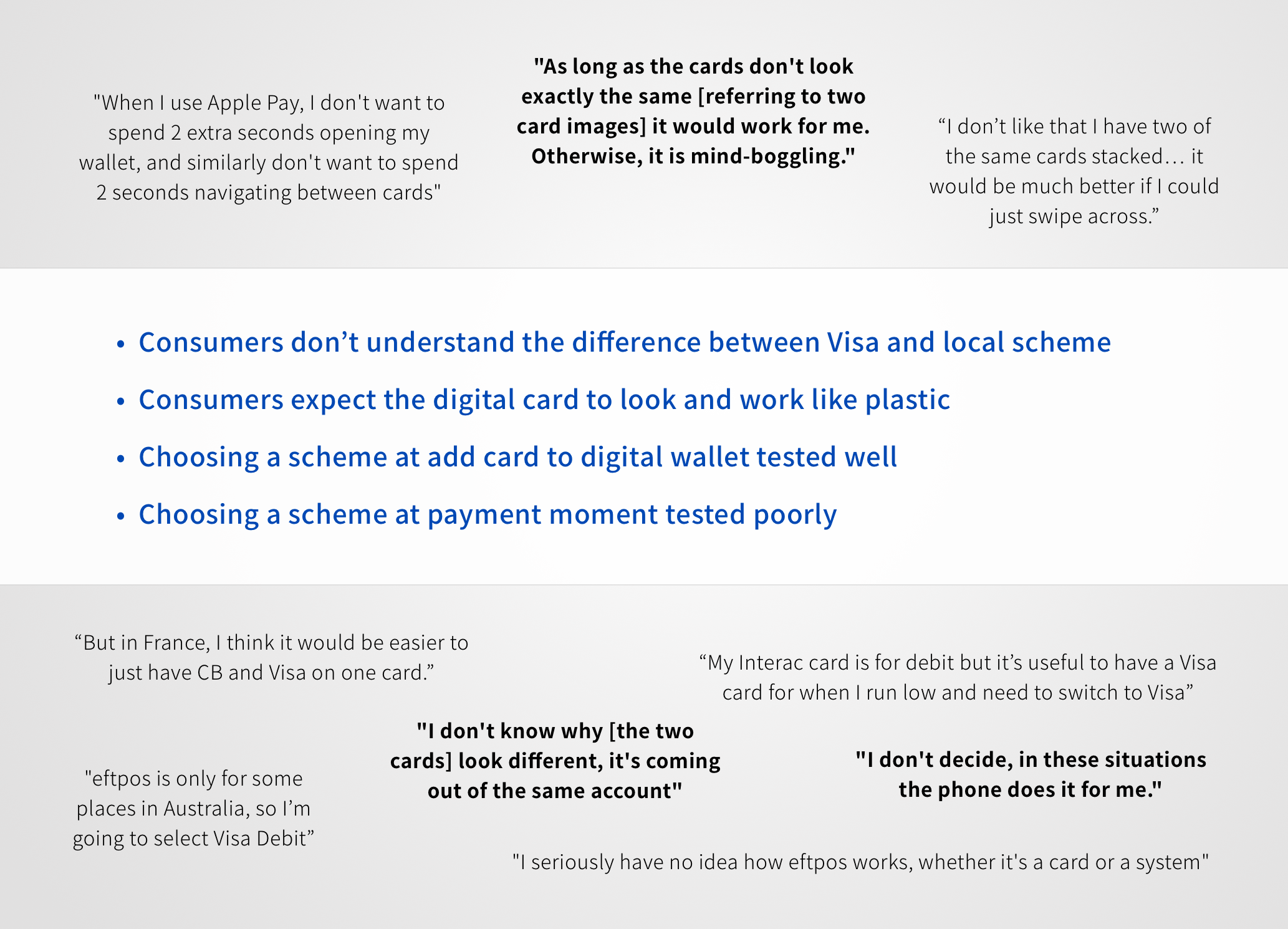
Though we welcomed new interpretations of the status quo, the UX research study concluded that payment scheme brands was not the place for innovation—users simply trusted the scheme brand as-is without completely understanding how it works, therefore regarding the digital card options unnecessary. In the end, the status quo remained the most preferred option. For more aware users, they liked having a way to select their preferred scheme when they set up a new card, so we added that new user preference into our final recommendation.
While sticking to the status quo seems to be the easy answer, it is clear that users have spoken and this is not something they want changed. As a designer who often plays the role of “innovating outside the box,” this opposite outcome showed me how powerful UX research is in guiding business strategy and innovation towards the right places.

